Fitness Credo: An Web Development Case Study for Fitness Brand
Glimpses:


Client Background:
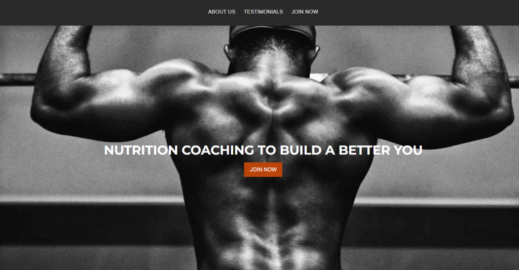
Meet Fitness Credo, an ambitious player in the fitness world, serving up health and wellness expertise to gym-goers, weekend warriors, and the perpetually “starting Monday” types. Their website, however, was struggling to keep pace. It was slow, clunky, and about as engaging as watching a treadmill gather dust. Fitness Credo wanted a sleeker, faster, and more intuitive online experience that could turn visitors into long-term followers, and future fit freaks.
Objectives:
Fitness Credo had a wishlist: a cutting-edge UI/UX experience, smooth-as-silk navigation, and lightning-fast load times (because who has the patience for slow websites these days?). And of course, it needed to look as good on mobile as it did on desktop because, let’s face it, most people check out fitness tips while lying on the couch.
Strategies Implemented:
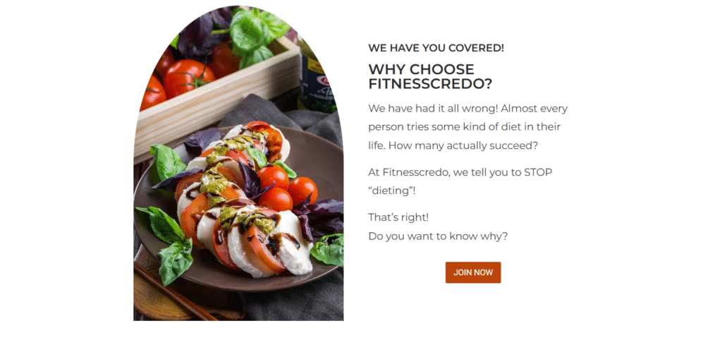
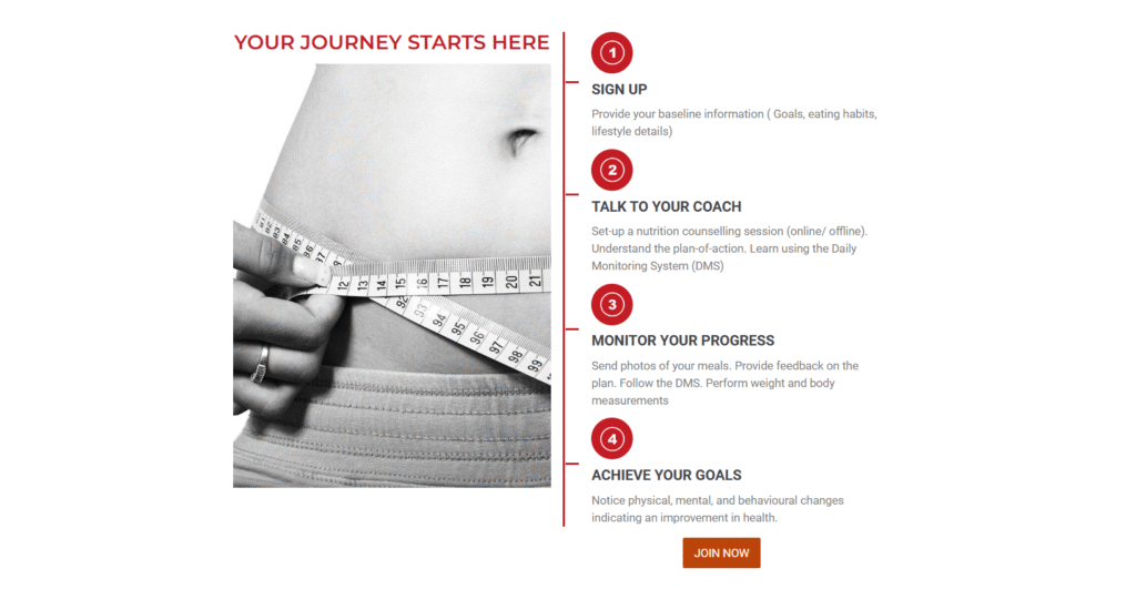
Our expert web development team at Owl Theory went full throttle. We pulled out all the stops with custom designs to give Fitness Credo a unique look that practically shouts, “I know fitness!” We handpicked a robust CMS that could handle the site’s needs, beefed up site performance to keep load times minimal, and made sure the experience was buttery smooth across all devices. The result? A website that doesn’t just talk the talk it sprints the sprint.
Challenges Faced:
Now, it wasn’t all a smooth jog in the park. We ran into some, shall we say, “legacy hurdles.” Think outdated systems, an urgent timeline, and feature requests that could fill a protein shake bottle. But our team loves a challenge especially when it comes with tight deadlines. We hustled, innovated, and somehow made it all work without pulling any hamstrings.
Results:
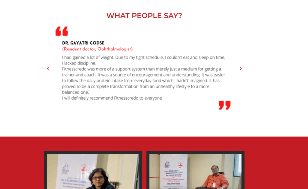
What came out of this digital overhaul? A masterpiece. The new Fitness Credo site is a visual and functional powerhouse. We saw bounce rates drop faster than a squat rack during leg day, and the time visitors spent on the site increased notably. Users raved about the site’s look and feel, calling it “as refreshing as a cold towel after a HIIT session.”
Key Takeaways:
This project was a slam dunk, proving that a well-thought-out strategy and some serious digital muscle-flexing can work wonders. Fitness Credo got exactly what they needed: a user-friendly, conversion-driving website that not only looks great but actively supports their business goals.